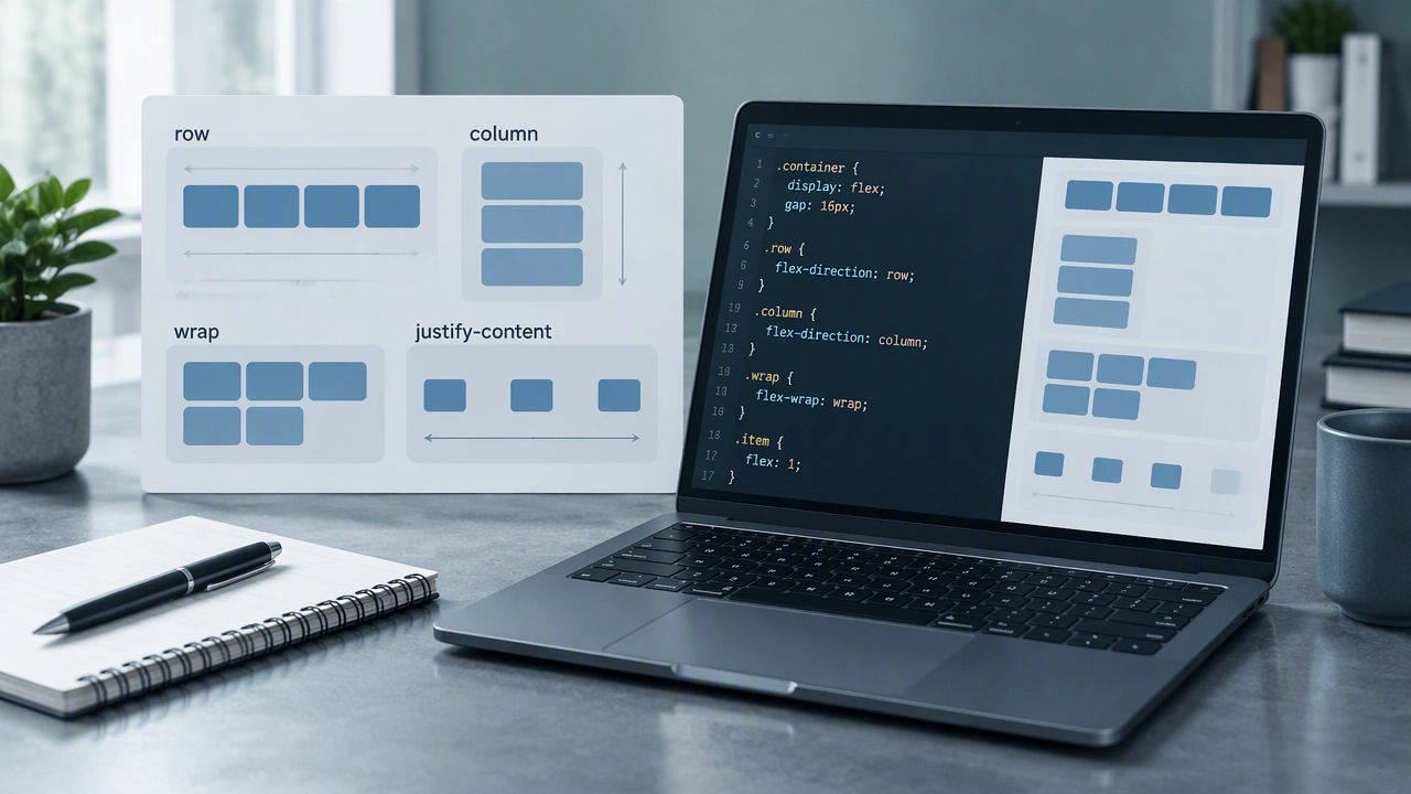
CSS Flexbox Explained with Examples: A Visual, Example-Driven Walkthrough for Clean Rows and Columns
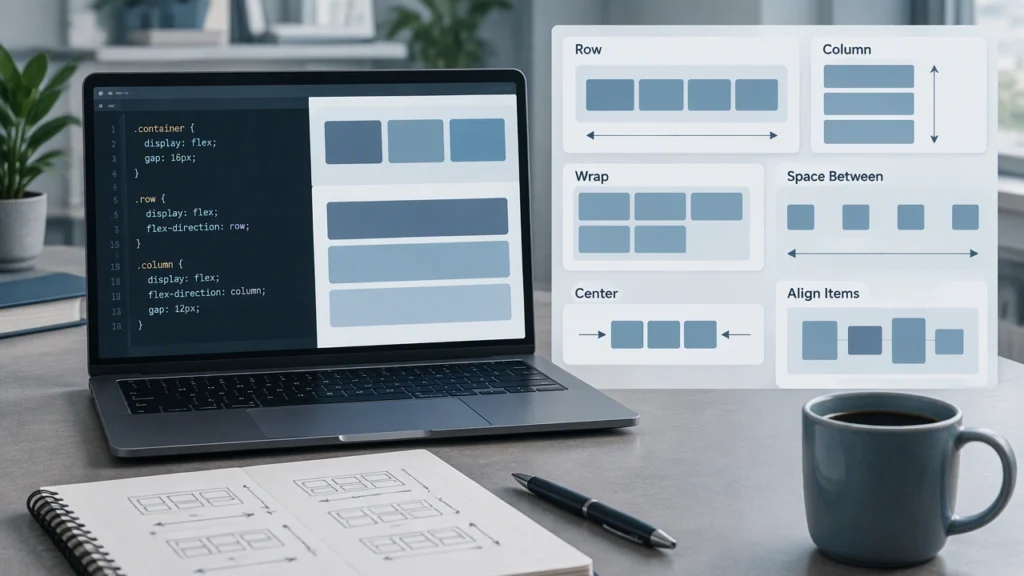
Flexbox is one of the most practical layout systems in CSS because it lets you control how items sit in a row or column, how they grow or shrink, and how they line up along the main and cross axes. If you are building navigation bars, card rows, form layouts, or component spacing, Flexbox gives you predictable tools with clear rules. In this technology school style walkthrough, you will see small, visual examples that build up one idea at a time, so you can learn by reading the code and imagining the result.
The long-tail goal here is to show how to use CSS Flexbox to align items with examples that you can adapt to real projects. We will start with the container, move to item behavior, then cover alignment, wrapping, and common patterns you can reuse.
What Flexbox actually does
Flexbox works on a parent-child relationship. You make a container a flex context, and its direct children become flex items. From there, you control the direction of the layout, the spacing between items, and how items align on two axes:
- Main axis: the direction set by flex-direction, usually horizontal in a row or vertical in a column.
- Cross axis: the perpendicular direction, so vertical in a row or horizontal in a column.
Understanding these axes is the key to every alignment decision. Once you know which axis you are targeting, properties like justify-content and align-items become straightforward.
Turn on Flexbox
Start with a container and a few items. This minimal HTML is enough for our examples:
- A .container div
- Three child .item divs with short labels
Then set the container to display flex. At this point, the items sit in a row by default.
- .container { display: flex; }
That single rule gives you a row of items with even spacing if you add gap later. It also makes alignment properties available on the container.
Direction and the main axis
By default, flex-direction is row, so the main axis runs left to right. You can flip the axis or change the layout mode:
- row: items flow horizontally.
- row-reverse: items flow horizontally in reverse order.
- column: items stack vertically.
- column-reverse: items stack vertically in reverse order.
Try this mental example. If you set flex-direction: column and give the container a fixed height, you can space items from top to bottom. The same alignment properties you use in rows now control the vertical main axis.
Spacing along the main axis
Once your direction is set, justify-content distributes items along the main axis. Common values are easy to visualize:
- flex-start: items pack to the start.
- center: items center along the main axis.
- flex-end: items pack to the end.
- space-between: first item at the start, last item at the end, equal space between.
- space-around: equal space around each item, with half-space at the edges.
- space-evenly: equal space between items and at the edges.
For clean spacing without measuring margins, add gap to the container. Gap is predictable and avoids extra spacing at the edges, which is great for grids and toolbars.
- .container { display: flex; gap: 12px; }
Cross-axis alignment
With the main axis handled, turn to the cross axis. align-items controls where items sit across the container:
- stretch: items stretch to fill the cross axis if no fixed size is set.
- flex-start: items align to the top in a row.
- center: items center vertically in a row.
- flex-end: items align to the bottom in a row.
- baseline: items align by text baseline, which is useful for labels and buttons.
If you need to align a single item differently from the rest, use align-self on that item. It overrides the container setting for that one element.
Wrapping and flow
By default, Flexbox keeps items on one line. To let items move to new lines when space runs out, enable wrapping:
- .container { flex-wrap: wrap; }
With wrapping on, the container becomes a multi-line flex layout. Pair this with gap to keep consistent spacing across lines. If you want every item to grow equally to fill a row, combine wrapping with flex properties on the items.
Item sizing with flex shorthand
Flex items can grow, shrink, and set a base size. The shorthand flex: grow shrink basis makes this easy:
- flex: 1 1 0; lets items grow equally and share space.
- flex: 0 0 auto; keeps items at their content size.
- flex: 1 1 200px; lets items grow and shrink around a 200px base.
A practical rule is to start with flex: 1 1 0 for equal columns, or flex: 0 1 auto for cards that keep their natural width and only shrink when needed.
Common layout examples
Navigation bar with logo and actions
- Set the container to display: flex and align-items: center.
- Place the logo on the left and a button group on the right.
- Add margin-left: auto to the button group, or use justify-content: space-between to push them apart.
- Use gap to space the links evenly.
Card grid with equal columns
- Set the container to display: flex, flex-wrap: wrap, and gap: 16px.
- Give each card flex: 1 1 240px so items wrap at around 240px and grow to fill the row.
- Use align-items: stretch so cards in the same row share height.
Centered content in a section
- Set the container to display: flex, justify-content: center, and align-items: center.
- Give the container a fixed height or min-height to give the cross axis space to work.
Sidebar and main content
- Use a row container with two children: .sidebar and .main.
- Set .sidebar { flex: 0 0 260px; } and .main { flex: 1 1 auto; }.
- This keeps the sidebar fixed while the main area fills the remaining space.
Alignment patterns you will reuse
- Center a button group: container with display: flex, justify-content: center, and gap: 8px.
- Push one item to the end: add margin-left: auto to that item, or place it last and use justify-content: space-between.
- Make equal columns: children with flex: 1 1 0 and a container with gap.
- Prevent overflow: add min-width: 0 to long content items so text can shrink instead of breaking the layout.
Accessibility and responsiveness
Flexbox does not change accessibility by itself, but it helps you build logical order and spacing. Keep these habits:
- Maintain a sensible DOM order so keyboard and screen reader navigation matches the visual layout.
- Avoid using order to radically change reading order.
- Use gap and consistent alignment so interactive targets are easy to tap.
- Prefer flexible bases like percentages or min/max values so content scales well.
Debugging tips
When a layout looks off, check these first:
- Is the parent actually set to display: flex?
- Is flex-direction what you expect, row or column?
- Did you set flex-wrap if you need multiple lines?
- Are items shrinking because of overflow or long text? Try min-width: 0.
- Are you mixing justify-content and align-items on the right axes?
Browser DevTools help a lot. Most tools show the flex axes and let you toggle alignment values in real time, which makes learning faster.
When to choose Flexbox
Choose Flexbox for one-dimensional layouts: a row or a column, even if that row wraps. For two-dimensional grids where you need precise row and column tracks, CSS Grid can be a better fit. In practice, many pages use both: Grid for the page skeleton and Flexbox for components like headers, toolbars, and card internals.
With these examples, you now know how to use CSS Flexbox to align items with examples you can copy and adapt. Start with direction and axes, add alignment, then tune sizing with flex properties. Once you internalize the axis model, Flexbox becomes a calm, reliable tool for clean rows and columns in any interface.